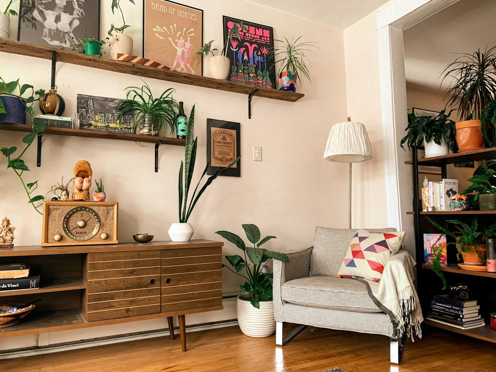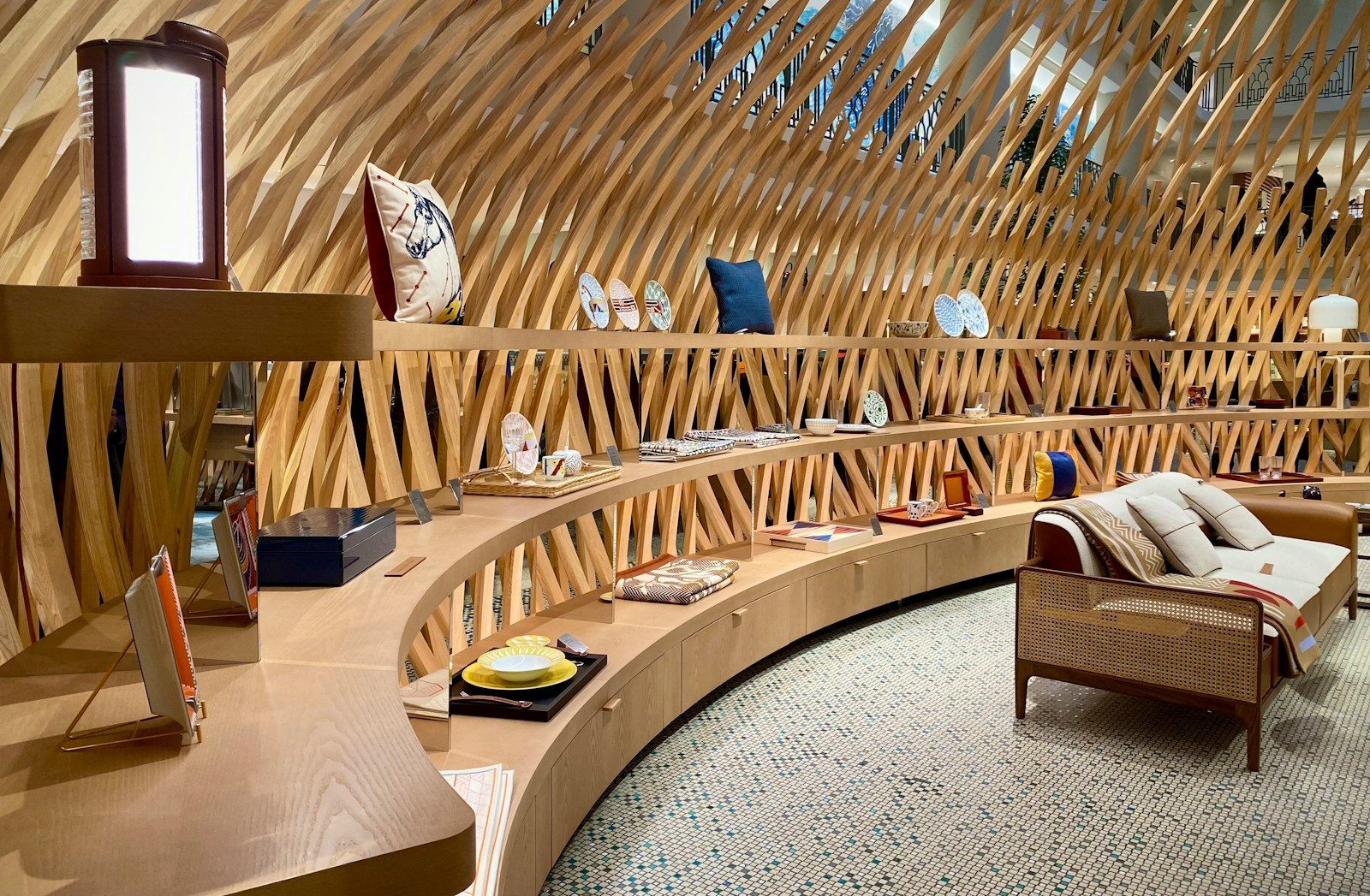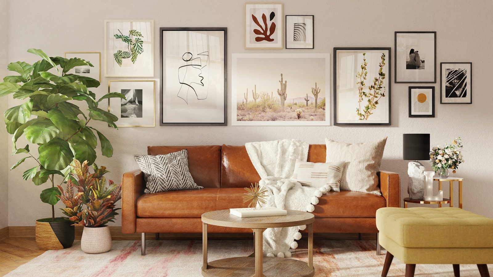
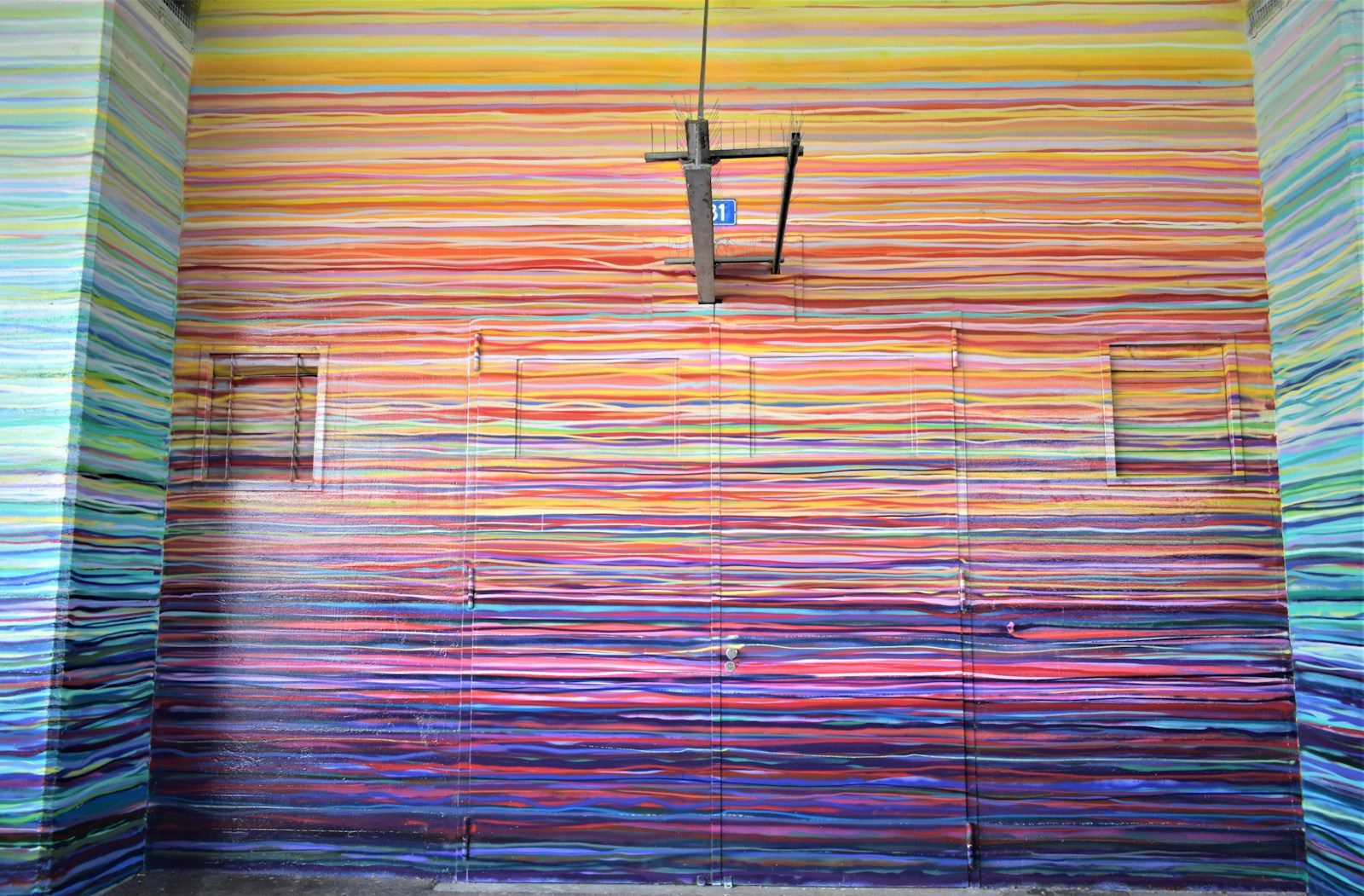
In 2026 color drenching is no longer just something people save to mood boards. Designers and homeowners are using it to create spaces that feel calm layered and full of personality. The idea is pretty straightforward. Instead of mixing lots of different colors you paint the walls trim ceilings shelves and sometimes even the doors in the same color family. Everything flows together and feels connected. Depending on the shade and textures you choose the room can feel dramatic cozy elegant or soft.
Search trends on Pinterest show growing interest in rich greens cool blues deep plum shades and earthy orange tones. Designers are moving away from plain white rooms because more people want homes that feel warm welcoming and lived in rather than perfectly staged.
What makes color drenching so appealing is that it works almost anywhere. It looks great in apartments family homes rentals and even very small rooms. You do not need expensive furniture or designer decor to pull it off either. The real key is understanding how color light texture and balance work together.
This guide will show you how to use color drenching in a practical modern way so your home feels stylish polished and naturally Pinterest-worthy without looking forced or overdone.
Why Color Drenching Became the Biggest Modern Interior Trend
Color drenching became popular because many modern homes started feeling a little too cold and repetitive. For years the same look was everywhere. White walls gray furniture and minimal decor. It looked clean and modern in photos but a lot of people felt those spaces were missing warmth and character.
Now homeowners are looking for rooms that feel comfortable personal and inviting. That shift has pushed designers toward richer colors and more immersive spaces. Instead of painting a single accent wall many people are now covering an entire room in one tone to create depth and atmosphere. Recent Pinterest trend reports show strong interest in shades like jade green plum noir cool blue and persimmon-inspired interiors.
Why Social Media Helped the Trend Explode
Platforms like Pinterest and TikTok have completely changed the way people decorate their homes. A fully drenched room tends to photograph better because there are fewer sharp visual breaks. Everything feels connected and intentional.
Designers have also noticed that these rooms often get stronger reactions online because they create a more immersive feeling. People can imagine themselves in the space instead of simply looking at it.
Why the Look Feels More Expensive
Luxury hotels and boutique cafes often stick to one dominant color throughout a room because it creates a smooth visual flow. When the walls ceiling trim and shelving blend together your eyes move naturally around the space.
This simple approach can make:
- Small rooms feel larger
- Tall rooms feel softer
- Budget furniture look more refined
- Clutter seem less noticeable
That is one reason even a simple apartment can feel professionally designed when color drenching is done well.
Choosing the Right Color for Your Space
One of the biggest mistakes people make is choosing a trendy color before thinking about how they want the room to feel. Color drenching works best when the shade supports the mood of the space instead of fighting against it.
A bedroom usually needs calm relaxing energy. A dining room can handle something richer and more dramatic. A home office often benefits from grounding colors that help with focus. Think about the purpose of the room first and then choose the paint.
Colors That Work Best in 2026
Designers are leaning toward earthy emotional shades rather than flat neutral colors. Some of the most popular choices right now include:
- Jade green for calm and balance
- Cool blue for soft modern spaces
- Plum noir for dramatic rooms
- Persimmon for warmth and creative energy
- Clay and mushroom tones for natural interiors
You will see these shades showing up across paint collections trend forecasts and interior projects all over the world.
How to Test Colors Properly
Paint can look completely different depending on the time of day. Before making a decision test samples on at least two walls and check them under different lighting conditions.
Look at the color during:
- Morning light
- Afternoon sunlight
- Evening lamp lighting
A sage green may look soft and fresh during the day but feel muddy at night. A deep blue could look elegant in one room and almost black in another.
Both Sherwin-Williams and Benjamin Moore offer peel-and-stick paint samples that make testing much easier without having to repaint entire walls.
Never choose a paint color based only on a phone screen or a Pinterest image because lighting changes everything.
How Lighting Changes a Drenched Room
Lighting has a huge impact on how a color-drenched room feels. The exact same paint color can feel cozy dramatic airy or gloomy depending on natural light bulb temperature and the direction your windows face.
A lot of people blame the paint when the real issue is actually the lighting.
Understanding Natural Light
North-facing rooms usually feel cooler and darker. Warm greens clay shades and soft beige tones often work well because they balance out that cooler light.
South-facing rooms receive stronger sunlight so deeper colors like plum olive and navy tend to look richer rather than overwhelming.
East-facing rooms are usually brighter in the morning while west-facing rooms become warmer later in the day.
Smart Lighting Choices for Better Results
Most designers have moved away from harsh bright white ceiling lights. Softer layered lighting helps color drenching feel more intentional and comfortable.
A good setup often includes:
- Warm table lamps
- Wall sconces
- Soft LED strips
- Floor lamps near corners
- Dimmer switches
Many interior designers also recommend using different paint finishes throughout the room. Flat ceilings paired with eggshell walls and satin trim create subtle depth without introducing another color.
Think about a dark green living room. During the day sunlight brings out the warmth in the paint. At night warm lamps create a cozy cocoon-like feeling that feels relaxing rather than heavy.
The right lighting is often what turns color drenching from a trend into something that feels timeless.
The Best Rooms for Color Drenching
Not every room responds to color drenching in the same way. Some spaces naturally benefit from it while others need a little more planning.
Smaller enclosed rooms often deliver the strongest results because the color completely surrounds the space.
Bedrooms Create the Best Results
Bedrooms are one of the easiest places to try color drenching because it instantly makes the room feel softer and quieter. Deep sage muted blue dusty mauve and earthy taupe are all great options for creating a relaxing atmosphere.
Painting wardrobes trim and ceilings in the same color also reduces visual clutter which can make smaller bedrooms feel calmer and more spacious.
Dining Rooms and Studies Handle Bold Colors Well
Dining rooms often look beautiful in darker shades because people usually spend time there during the evening. Colors like plum noir olive green chocolate brown and charcoal blue create warmth and atmosphere under softer lighting.
Home offices benefit too. Immersive colors can help reduce distractions and many designers now prefer darker paint behind desks because it creates a cleaner more focused backdrop during video calls.
Rooms That Need Extra Caution
Open-concept spaces can feel a little heavy if color drenching is not done carefully. In these rooms designers often recommend tonal drenching where the walls and ceilings use slightly different shades from the same color family.
Bathrooms can also work surprisingly well especially when paired with:
- Limewash textures
- Matte finishes
- Soft stone surfaces
- Brass fixtures
Even tiny powder rooms are showing up more often on Pinterest because bold color helps them feel intentional and memorable rather than overlooked.
How to Match Furniture With Drenched Walls
One reason color drenching looks so polished is because the furniture feels like part of the room instead of looking separate from it. Everything works together and creates a more natural flow.
The goal is not to make everything match perfectly. It is about creating balance and harmony.
Use Texture Before Contrast
When every item in a room matches exactly the space can start to feel flat and lifeless. Instead of bringing in random colors try adding different textures to create interest.
For example:
- Linen sofas soften darker walls
- Bouclé chairs bring warmth and comfort
- Walnut wood adds richness and character
- Marble surfaces help bounce light around the room
- Matte ceramics add depth and subtle detail
This approach keeps the room interesting without disrupting the overall color palette.
The Best Furniture Pairings
Jade green walls look beautiful with oak furniture and cream-colored fabrics. Plum-toned walls pair naturally with velvet antique brass and black accents. Cool blue spaces often feel more balanced when combined with warm wood finishes and textured rugs.
Designers also like to introduce contrast carefully. Sometimes one standout piece is all it takes to keep a room from feeling too uniform.
A good example is the “unexpected red theory” which has become popular on platforms like Pinterest. The idea is simple. A small touch of red can bring energy into a softer room and make everything feel more dynamic.
A red vase rust-colored chair or burgundy lamp can instantly add character without taking over the entire space.
The most inspiring homes rarely look perfectly matched. They feel balanced layered and personal.
Ceiling and Trim Tricks That Make the Look Feel Expensive
A lot of homeowners stop after painting the walls but the ceiling and trim are often what make a color-drenched room feel complete. Once those elements blend into the same color family the entire room feels more immersive and thoughtfully designed.
That is one reason boutique hotels and luxury interiors often feel so polished.
Why the Ceiling Matters
A bright white ceiling creates a clear visual break. In a color-drenched room that break can interrupt the overall mood.
Painting the ceiling the same color as the walls softens those edges and creates a cozy cocoon-like feeling. Designers especially love using this trick in:
- Bedrooms
- Libraries
- Dining rooms
- Hallways
- Small apartments
Many recent interior design reports show painted ceilings becoming more popular because homeowners are starting to see the ceiling as a fifth wall rather than something that should always stay white.
Using Different Sheens for Depth
One simple designer trick is mixing paint finishes instead of using the exact same finish everywhere.
A common combination looks like this:
- Flat finish on ceilings
- Eggshell finish on walls
- Satin finish on trim and doors
The subtle difference in sheen changes how light hits each surface which adds depth without introducing another color.
Some designers even paint bookshelves radiators curtain rods and outlet covers to match the room. Small details matter because bright white accessories can quickly break the seamless effect.
The more connected everything feels the more polished the finished space looks.
Small-Space Color Drenching Ideas That Actually Work
Many people assume dark paint automatically makes a room feel smaller but that is not always true. In many cases color drenching can actually make a compact room feel larger because your eye is not constantly stopping at contrasting edges.
The secret is choosing the right shade and using texture wisely.
Why Small Rooms Benefit Most
Small rooms often have a lot going on visually. White walls can sometimes draw attention to every shelf corner and piece of furniture.
Color drenching reduces contrast and helps everything blend together more naturally.
This works especially well in:
- Studio apartments
- Small bedrooms
- Narrow hallways
- Powder rooms
- Compact kitchens
Many designers now recommend earthy greens clay shades and rich chocolate browns for smaller spaces instead of relying on plain white walls.
Practical Tricks for Better Results
A few small changes can make a huge difference:
- Use mirrors to reflect light
- Choose curtains close to the wall color
- Add layered lighting instead of one bright ceiling fixture
- Pick furniture with low contrast
- Use larger rugs to create fewer visual breaks
For example a small olive-green office with matching trim and shelves can often feel calmer and more spacious than a bright white office filled with sharp contrasts.
A bathroom is also a great place to start if you are new to color drenching. Since the room is already enclosed bold color usually feels intentional rather than overwhelming.
That is one reason so many people on Pinterest start with smaller rooms before moving on to larger spaces.
Modern Pinterest Color Palettes Trending in 2026
Color trends today are less about perfection and more about creating a feeling. Instead of sterile beige interiors homeowners are choosing colors that feel warm expressive and personal.
Trend reports from Pinterest and leading design publications show a growing love for earthy shades mixed with bold accents.
The Most Popular Color Families
A few color palettes are showing up everywhere right now.
Cool Blue creates calm inviting spaces with a soft modern feel. It works especially well in bedrooms and entryways.
Jade Green has become almost a new neutral. Designers use it in kitchens offices and living rooms because it pairs beautifully with natural wood.
Plum Noir adds drama and depth without feeling harsh. It is perfect for dining rooms libraries and moodier evening spaces.
Persimmon brings warmth creativity and energy. It works especially well with walnut wood and vintage decor.
How Designers Combine These Colors
Modern interiors are moving away from random pops of bright color. Instead designers create balance by pairing strong colors with natural materials such as:
- Walnut wood
- Linen fabrics
- Limewash walls
- Stone surfaces
- Brass accents
Another growing trend is tonal drenching where different shades from the same color family are layered together.
For example dusty sage walls paired with a deeper olive ceiling create depth and richness without feeling overwhelming.
The key is keeping things simple. The most beautiful Pinterest-inspired homes usually focus on one mood rather than trying to fit too many colors into the same space.
Paint Finishes and Textures That Add Depth
Color alone is not enough to create a beautiful room. Texture plays a huge role in how paint reflects light and how a space feels throughout the day.
That is why so many modern interiors combine color drenching with textured finishes instead of relying on perfectly smooth walls everywhere.
The Rise of Limewash and Matte Paint
Limewash paint has become incredibly popular because it creates gentle movement across walls. The finish feels soft natural and slightly imperfect in the best possible way.
Many designers use limewash in:
- Mediterranean-inspired homes
- Modern organic interiors
- Relaxed bedrooms
- Reading corners
Matte paint remains a favorite too because it absorbs light softly and helps create a calm atmosphere.
Mixing Materials for a Layered Look
Texture does not only come from paint.
A color-drenched room often feels richer when paired with materials like:
- Raw wood
- Woven baskets
- Linen curtains
- Stone lamps
- Ceramic vases
For example a cool blue room filled with glossy surfaces can sometimes feel cold. Add linen oak and matte pottery and the same room suddenly feels warm and inviting.
Designers in 2026 are putting more focus on tactile materials than ultra-polished finishes. Trend reports continue to show strong interest in aged wood honed stone and layered natural materials because homeowners want spaces that feel comfortable and lived in.
Texture is what keeps a single-color room from feeling flat.