Interior color trends in 2026 are all about making homes feel warmer more comfortable and more personal. For a long time cool gray walls and simple monochrome color schemes dominated interior design. Now that’s starting to change. Homeowners are looking for colors that feel welcoming natural and easy to live with every day.
Recent collections from brands like Benjamin Moore, Sherwin-Williams, and Behr Paint Company show a growing interest in earthy greens warm neutrals rich browns muted blues clay-inspired shades and carefully selected accent colors. Designers are also moving away from single-color rooms and instead layering multiple tones together to create depth and character.
The result is a home that feels balanced lived-in and timeless rather than something that follows a trend for a year and disappears.
Warm Neutrals Are Replacing Cool Gray

The New Foundation for Modern Interiors
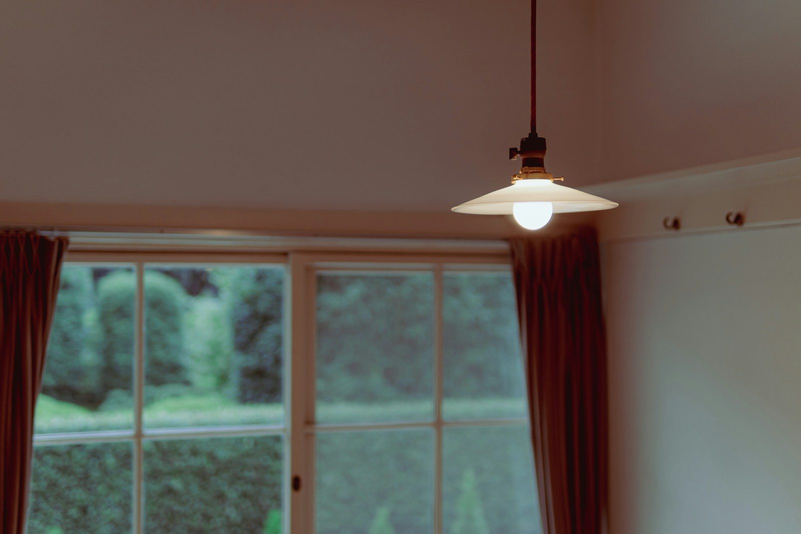
One of the biggest changes happening in 2026 is the shift away from cool gray walls. Designers are choosing warm neutrals because they make spaces feel comfortable while still looking fresh and modern. Shades like creamy white soft beige warm ivory greige and light khaki are becoming the foundation of many homes.
These colors are especially appealing because they respond beautifully to natural light. A room can feel bright and airy during the day and warm and cozy in the evening without feeling dull or flat.
Why Homeowners Prefer Them
People want homes that feel relaxing and inviting. After spending more time at home over the last few years many homeowners have realized that overly cool interiors can sometimes feel a little cold. Warm neutrals naturally create a softer and more welcoming atmosphere.
Practical Ways to Use Warm Neutrals
One of the easiest ways to make warm neutrals work is by combining them with natural materials. Wood linen and stone add texture and help the space feel layered rather than plain.
For example:
- Cream walls with oak flooring
- Beige upholstery with walnut furniture
- Warm white cabinetry with brass hardware
- Soft greige walls paired with textured rugs
These shades are also incredibly flexible. They work with almost any accent color which makes future updates much easier and more affordable.
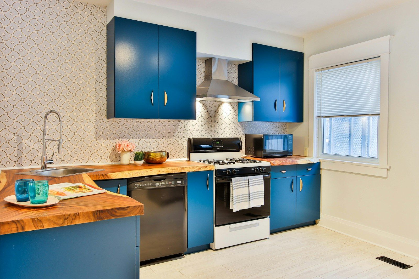
Earthy Greens Continue to Dominate

Nature Remains a Strong Design Influence
Green continues to be one of the most popular interior colors in 2026. Instead of bright emerald tones designers are leaning toward softer more natural shades like sage olive matcha and hunter green.
These colors help bring a sense of nature indoors and instantly make a room feel more grounded and balanced.
Different Greens for Different Rooms
Lighter greens work especially well in kitchens dining rooms and home offices where you want the room to feel fresh and bright. Darker shades are often used in bedrooms libraries and powder rooms where a little extra drama can make the space feel cozy and sophisticated.
A Real-World Example
Picture a kitchen with sage-green cabinets cream-colored walls and natural oak shelves. The combination feels fresh stylish and easy to live with.
Many designers are also using hunter green for color drenching where walls trim and cabinetry are painted in the same shade. This creates a rich layered look that works particularly well in smaller spaces.
One reason green remains such a favorite is because it can act almost like a neutral while still adding personality to a room.
Rich Browns and Umber Tones Make a Strong Return

The End of All-White Interiors
Brown is making a huge comeback. Rich umber chocolate brown warm mahogany and other earth-inspired shades are appearing in homes everywhere.
Designers love these colors because they add warmth and depth without sacrificing elegance.
A More Sophisticated Neutral
Brown is no longer seen as dark or outdated. When used well it feels sophisticated comfortable and timeless.
Where Brown Works Best
Popular applications include:
- Wood-paneled feature walls
- Dining room cabinetry
- Built-in shelving
- Upholstered furniture
- Bedroom accent walls
A chocolate-brown wall paired with cream furniture creates beautiful contrast while still feeling soft and welcoming.
Brown also works especially well with brass bronze linen and natural wood finishes which helps create a space that feels rich and layered.
Soft Blues Bring Calm to Modern Homes

A Gentle Alternative to Bold Color
Blue isn’t going anywhere but designers are choosing softer versions in 2026. Muted sky blue dusty blue and seafoam-inspired shades are becoming favorites because they bring color without overwhelming a room.
These shades feel calm fresh and easy to live with.
Why Designers Keep Returning to Blue
Blue works almost anywhere. It can help a bedroom feel relaxing a bathroom feel bright and a home office feel focused.
Creating a Balanced Blue Palette
A beautiful blue-based palette might include:
- Soft blue walls
- White trim
- Natural oak furniture
- Light gray textiles
- Brushed metal accents
Seafoam blue is especially popular because it combines the calming qualities of blue with the warmth of green.
Unlike many short-lived trends muted blues have been used in homes for decades and continue to feel relevant year after year.
Terracotta and Clay Shades Add Character

Warmth Inspired by Natural Landscapes
Terracotta clay rust and burnt sienna shades continue to grow in popularity. These colors bring warmth into a room without feeling as intense as bright reds or oranges.
A Comfortable Way to Use Color
Many people want more color in their homes but don’t want anything too bold. Terracotta offers the perfect balance. It feels warm inviting and full of character.
Practical Applications
Terracotta works beautifully on:
- Accent walls
- Fireplace surrounds
- Kitchen backsplashes
- Decorative niches
- Dining room walls
A clay-colored wall paired with cream furniture and black metal lighting creates a look that feels modern yet comfortable.
These shades also pair beautifully with natural materials like wood linen and rattan which helps create an organic and relaxed atmosphere.
Deep Burgundy Creates Dramatic Elegance

A Bold Trend with Lasting Appeal
Deep burgundy is one of the standout accent colors of 2026. Designers are using these rich wine-inspired shades to add depth sophistication and character.
Unlike bright red burgundy feels refined and timeless.
Where It Makes the Biggest Impact
This color works best when used intentionally rather than covering an entire home.
Designer-Approved Uses
Popular examples include:
- Dining room walls
- Library shelving
- Velvet seating
- Bedroom headboards
- Decorative accessories
Burgundy pairs beautifully with warm wood brass cream and charcoal creating a rich and elegant atmosphere.
When used carefully it adds drama without making a room feel overwhelming.
Pastel Gelato Shades Offer a Fresh Direction

Soft Colors Return in a New Form
Pastels are making a comeback but they’re being used in a much more sophisticated way. Designers are embracing pistachio green pale peach vanilla yellow and raspberry-inspired pinks.
These shades are often called gelato colors because they feel soft cheerful and uplifting.
Why They Feel Modern
The difference today is that these colors are used sparingly. Instead of covering entire rooms designers add them through cabinetry furniture artwork and accessories.
Successful Combinations
Examples include:
- Pistachio cabinets with cream walls
- Vanilla accents with oak furniture
- Peach textiles paired with stone surfaces
- Soft pink artwork in neutral spaces
These colors bring energy and personality while still feeling elegant.
Layering Colors Creates More Depth

Single-Color Rooms Are Becoming Less Common
One of the biggest design lessons of 2026 is that beautiful rooms rarely depend on just one color. Designers are building layered palettes that combine multiple complementary shades.
This approach creates depth and makes a room feel much more interesting.
Thinking Beyond Paint
Color isn’t just about wall paint. Furniture rugs curtains artwork and accessories all contribute to the overall palette.
A Layered Example
A living room might include:
- Warm beige walls
- Olive green chairs
- Walnut furniture
- Cream curtains
- Bronze accents
Together these elements create a balanced and cohesive space without feeling overly coordinated.
Room-by-Room Color Palette Ideas

Matching Color to Function
Every room serves a different purpose so the color palette should support how the space is used.
Practical Combinations That Work
Living rooms often benefit from warmth and flexibility while bedrooms usually need a calmer atmosphere. Kitchens can handle more personality and energy.
Recommended Pairings
Living Room
- Warm beige
- Olive green
- Walnut brown
Bedroom
- Soft blue
- Cream
- Light oak
Kitchen
- Sage green
- Ivory
- Brass accents
Home Office
- Muted blue
- Charcoal
- Natural wood
Dining Room
- Burgundy accents
- Warm white
- Dark wood
These combinations feel current while remaining practical enough to enjoy for years.
How Lighting Changes Every Color Choice

The Hidden Factor Many People Ignore
Lighting can completely change the way a color looks. A paint sample that seems perfect in a store can look very different once it’s on your walls.
Natural and Artificial Light Matter
North-facing rooms usually feel cooler while south-facing spaces receive warmer sunlight throughout the day.
Testing Before You Commit
Before painting an entire room:
- Test large paint samples
- Check them in the morning
- Look at them again in the evening
- View them under artificial lighting
Taking time to do this can prevent costly mistakes and help you feel much more confident in your final choice.
Designer Tips for Creating a Timeless Palette

Trends Should Support Your Lifestyle
A beautiful home should reflect the people who live there not simply follow what’s popular online. The best interiors are built around colors you genuinely enjoy.
Focus on Longevity
Choose larger permanent elements carefully and use trend colors in places that are easy to update later.
Smart Design Principles
- Keep large surfaces timeless
- Use accessories to experiment with trends
- Mix warm and cool tones thoughtfully
- Include natural materials
- Build your color palette gradually
Many of the most beautiful homes aren’t the most colorful. They’re simply balanced comfortable and personal.
Conclusion
The interior color palettes designers love in 2026 reflect a clear move toward warmth comfort and individuality. Cool gray minimalism is slowly being replaced by earthy greens rich browns warm neutrals soft blues terracotta shades and carefully selected accent colors.
The best interiors aren’t built around a single trendy color. Instead they combine layered palettes natural materials thoughtful lighting and texture to create depth and balance. Whether you choose a warm beige foundation a bold burgundy accent or a calming sage-green kitchen the goal is the same — creating a home that feels welcoming today and still looks beautiful years from now.